

A digital storefront built for the craftspeople who keep Hungary running.
See live website →Linardics Kft. had built a reputation over decades as one of Hungary's most trusted distributors of professional tools and industrial equipment. Their product catalogue was vast, their customer base loyal — but their digital presence hadn't kept up. An outdated website with poor navigation and no clear conversion path was costing them leads every day.
They needed more than a redesign. They needed a platform that could handle thousands of SKUs, serve both trade professionals and first-time buyers, and communicate the quality and expertise their brand had always stood for — just never shown online.
We started where every good project starts — by listening. Weeks of discovery sessions with the Linardics team helped us map how their customers actually shop: by trade, by brand, by application. The existing site forced users into a single flat catalogue. The new one would mirror the way a professional thinks — fast, purposeful, confident.
The architecture we built around their inventory let products be found three different ways simultaneously. Search, category, and curated collections — each path optimised for a different buyer intent. The result was a conversion-focused experience that didn't compromise on depth.
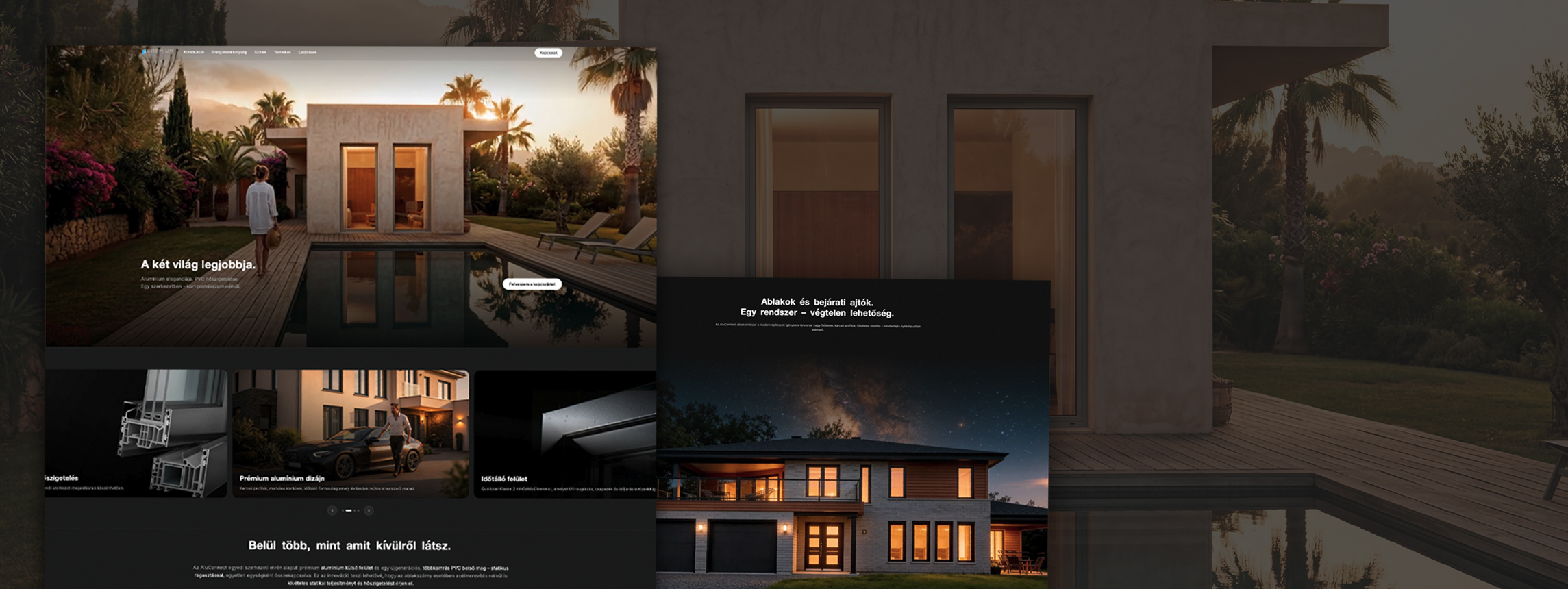
Every touchpoint — from landing page to checkout confirmation — was mapped and stress-tested. We ran usability sessions with real tradespeople and used the findings to strip back anything that slowed them down. The result was a funnel that felt effortless: browse, find, buy. Three steps. No distractions.
The mobile experience received particular attention. With over 60% of visits coming from phones — often at job sites, often in a hurry — we made speed and thumb-reachability non-negotiable design principles from day one.


The Linardics engagement had four phases — from strategy to code, from the first brief to launch day.
We mapped the business goals, the customer types, and the existing digital footprint. No good design decision exists without this foundation.
Information architecture, wireframes, then a full visual system — built for every screen. Structured enough to be trusted. Distinct enough to be remembered.
A handbuilt, template-free site. Fast load times, accessible markup, and a codebase the Linardics team can own and maintain without us.
Live deployment, technical QA, analytics setup. Handoff isn't the end of the project — it's when the first real data starts coming in.
The challenge wasn't design — it was hierarchy. We had to resist the temptation to add visual complexity and instead build confidence through structure.
Kutassy Bálint
Creative Director, KUTASSY
KUTASSY made it simple. They understood our business quickly, didn't waste our time on things that didn't matter, and delivered something we're genuinely proud to send customers to.
Gábor Linardics
Managing Director, Linardics Kft.